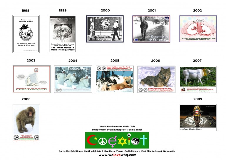
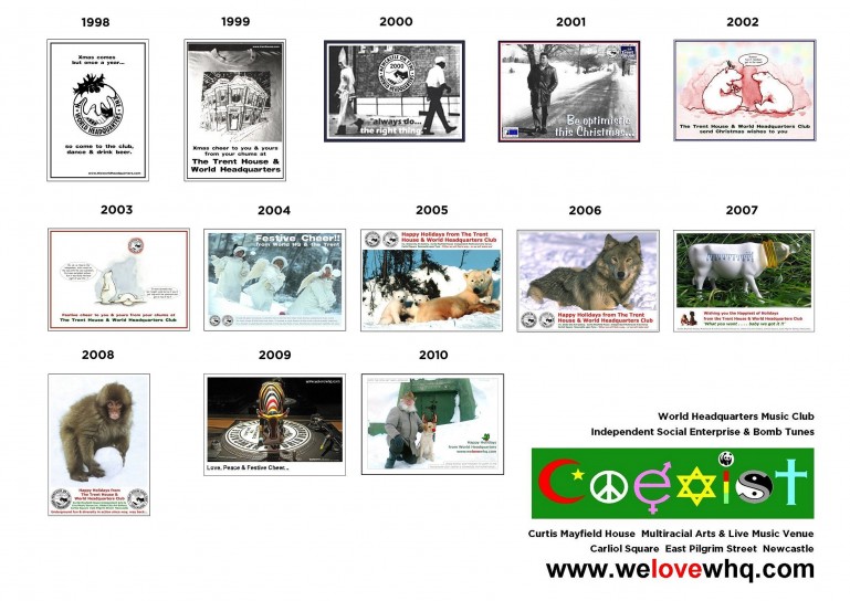
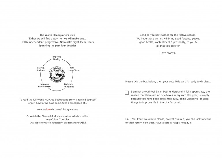
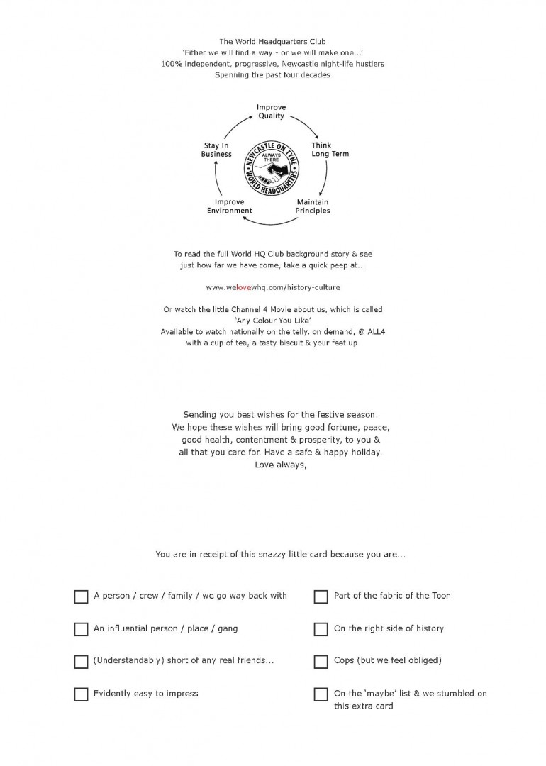
WHQ & Xmas cards
A Quest for Perfection
Or more accurately, a cautionary tale where all too often, OCD chums up with a choc-craved stagger to the all-night garage.
This bit is deep & it may be just too detailed & nuts, for many people to really get into. That said, it gives a fab insight into just how far we have taken our vibe over many decades & is packed with fun facts, numerous smirks & back in the day waffle.
This section is for the true WHQ connoisseurs...
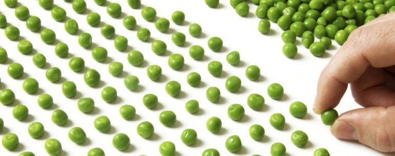
 Shoulda stayed back in the office & just eaten the peas.
Our Xmas cards for 2020/2 were cancelled
We didn't be send a card out at Xmas 2020, due to the pinch the Covid 19 pandemic put us under. Having had to lay all our staff off, we felt it wasn't an appropriate expense that year. Then is 2021 we were still so busy stabilising things we had to miss another year.
Rest assured we'll be back & smack on point for 2022. For now let's take a look at just how mad we usually get with it...
DIY Festive Cheer
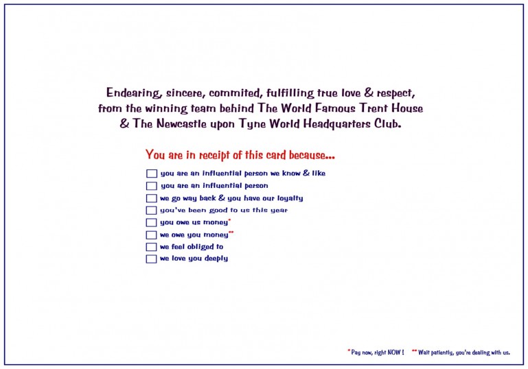
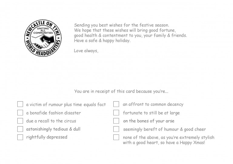
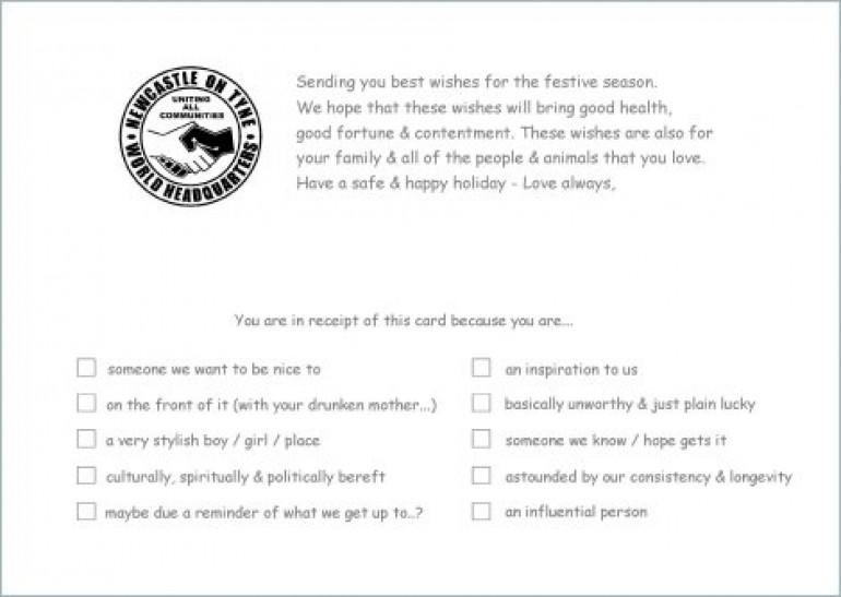
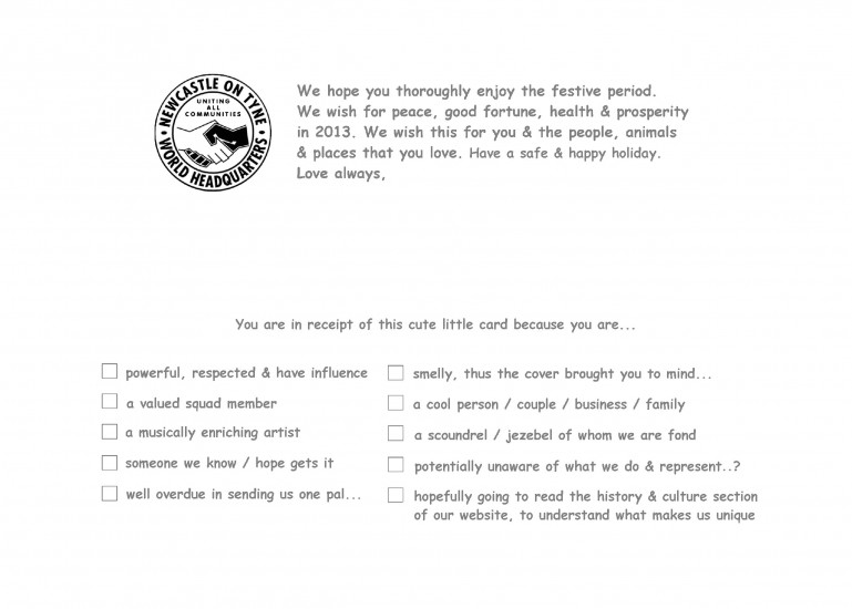
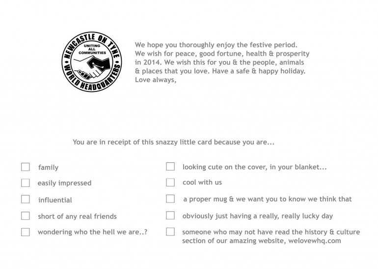
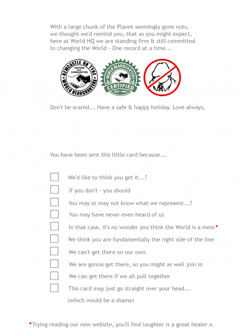
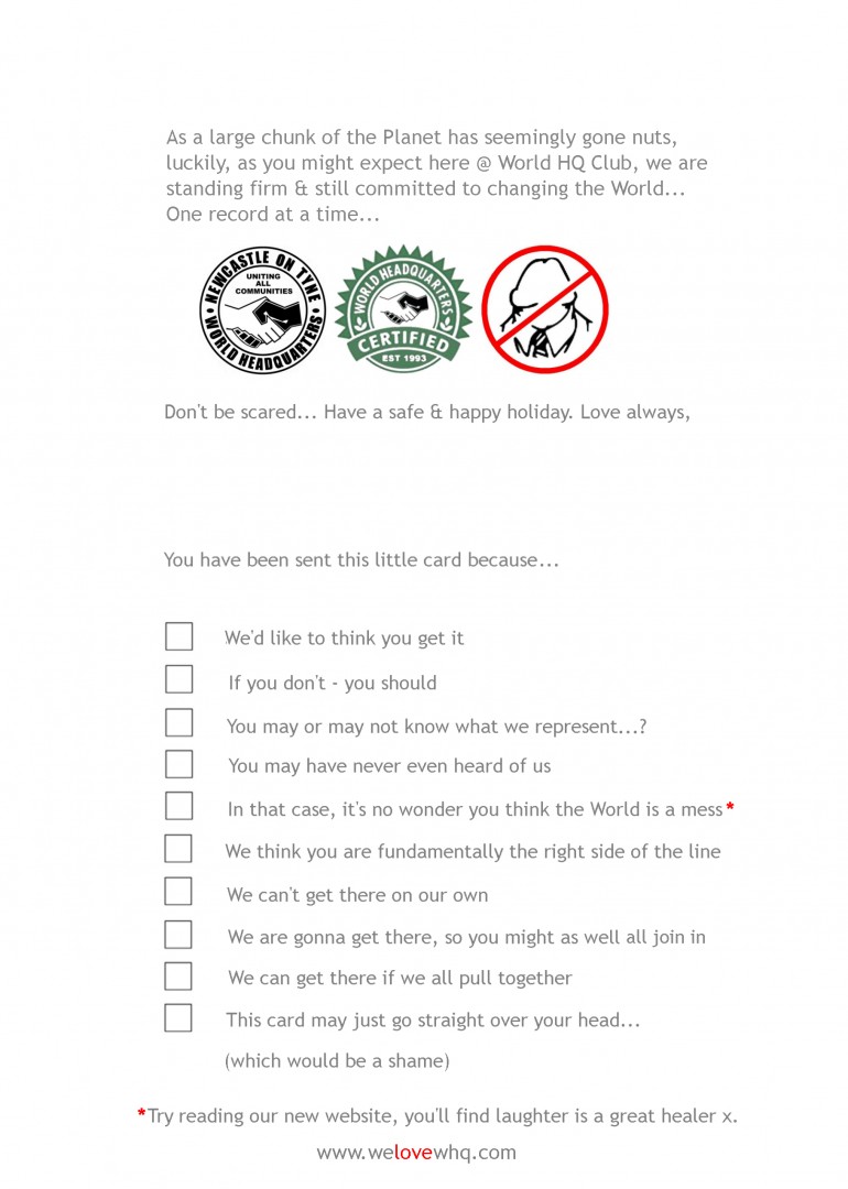
At WHQ we have a lot of friends & we send hundreds of Xmas cards annually which we design ourselves, usually with a daft little tick-box format. We ‘sampled’ the tick-box idea from a card Chris Viz sent us decades ago & have pretty much run with it since (in one form or another). It’s become something of a festive tradition for us now.
We try to be either funny, or topical each year & we send them, to keep in touch with people who have helped (or hindered) us.
It's always a cool vibe, if at any point in a given year we have to randomly, get in touch with say, someone at the Council we haven’t chatted to for years, or some surveyor we worked with twenty years ago or something...
Often the very first thing they’ll do, is to mention the Xmas card & thank us for remembering them.
 To remind folk you appreciate them.
It’s just us reaching out & spreading the festive cheer & it sure does that. The Newcastle we live in runs largely on favours & goodwill.
Let's face it, everyone likes to have a chuckle & be remembered @ Xmas.
DIY Festive Fistula
The Xmas card is actually a massive pain (in the rectum), as we always swear that we will knock the idea out over the Summer when we have more time, but we never ever do.
So smack in the middle of the mad Autumn season, we find ourselves having to pull last minute, sleep deprived all-nighters, to get it all designed, printed, ticked, signed & out in time, to arrive for while folks are all still around in mid December.
 Gotta try & plan, to get the important jobs sorted in time.
Always worth it though as it’s a cool thing to do, total game & a really nice touch.
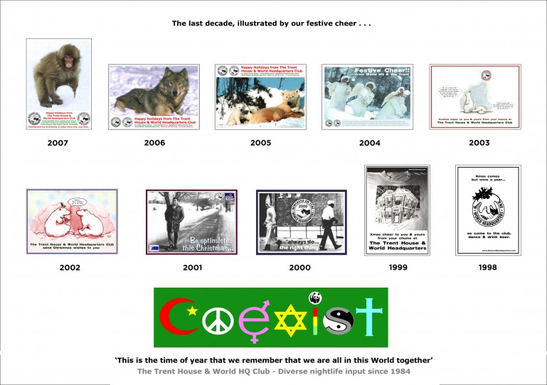
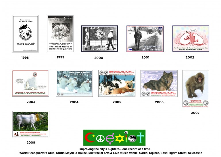
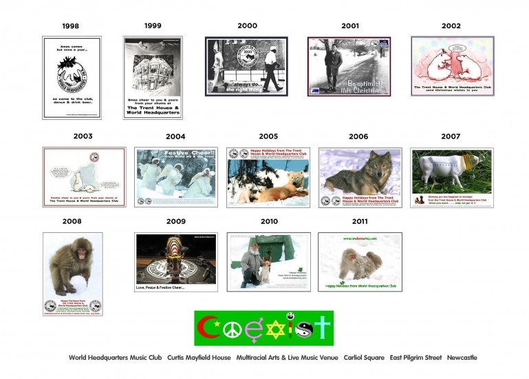
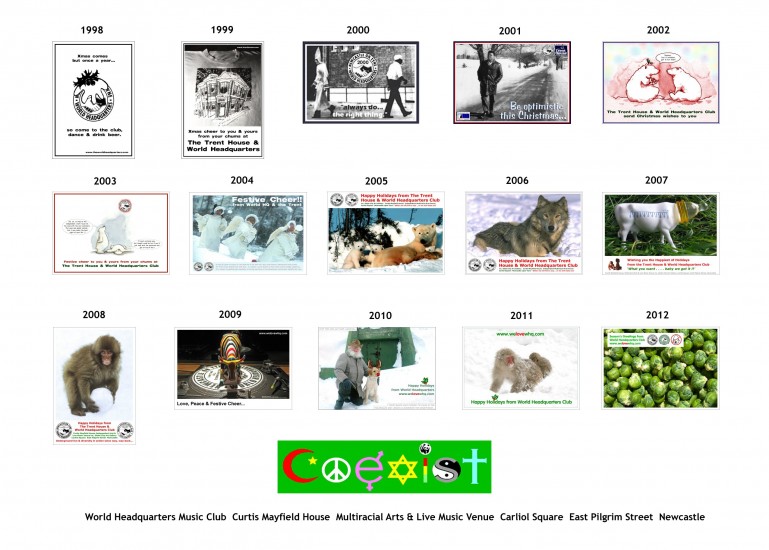
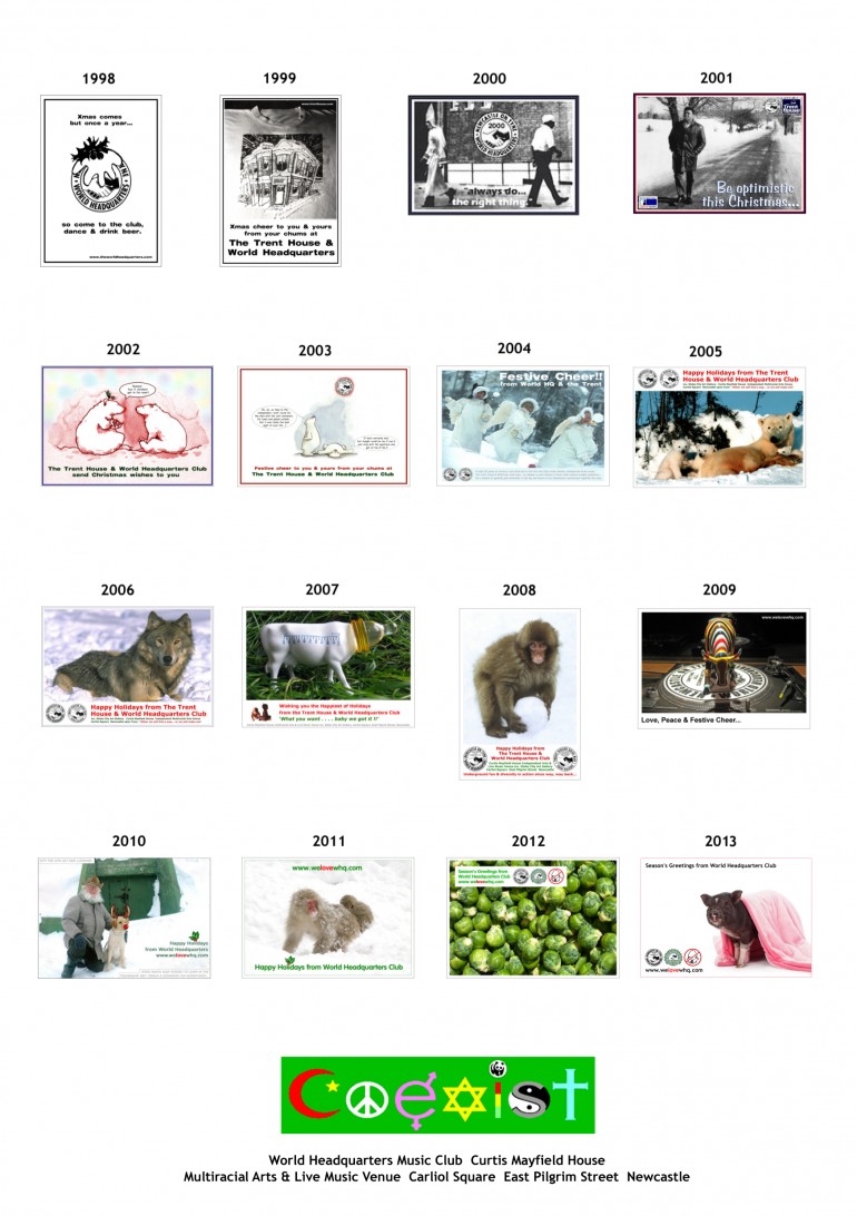
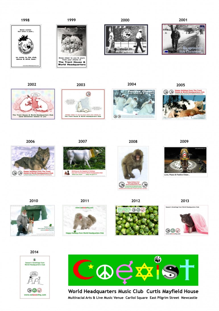
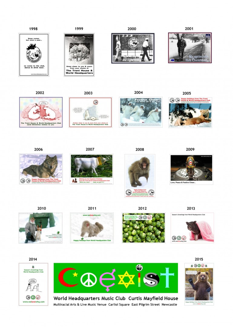
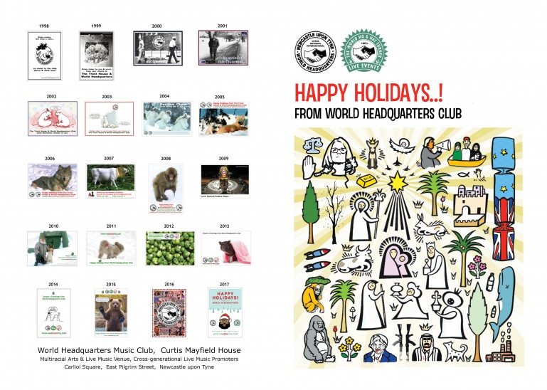
Below are all the past Xmas card artworks dating back, that we still have on file, for you to peep through...
It's worth noting, that as you shall clearly see, this is 100% totally ridiculous & OCD a-go-go. Please do believe us when we say...
We already know that - Enjoy x.
 I hear they get better, the further you scroll down through time..?
The Xmas Card Hustle...
Trent 1992
Old Skool, classic & it doesn't get any more direct than this. Our 'multiracial living is fun' message, distilled to it's absolute purest, festive form.
 Nice & sharp.
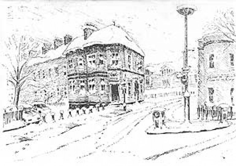
Trent 1996 Front
Really lovely, evocative, hand drawing of the Trent House in the Wintertime. Can't for the life of us recall who the artist was..? But we'll have paid them in beer, that's for sure.
Also, dunno if that year we decided to do a separate card for the Club..? It was open by then. If so, that's a shame as it's artwork is no longer in the vaults.
 Beautiful. Always loved it in the snow, as was so warm inside & there was beer.
1999 Front
Based around a photo of a Trent T shirt. Feat. a hand drawn cartoon of the Trent House, pretty obviously done by our old & much loved cohort, Chris Donald from Viz Comic.
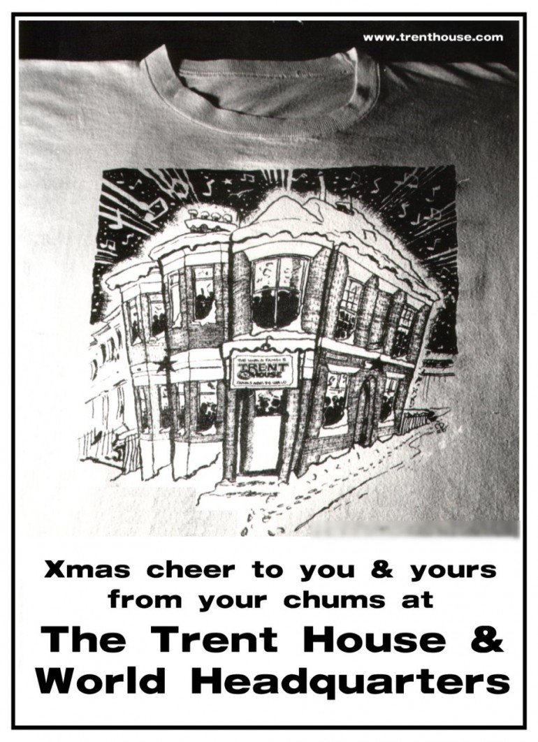 You see..? The Club's on there too now.
1999 Inside
An early execution of a multiple choice idea for the inside. We tried to pass the job of marking the cards on, to each individual recipient & trialed this style.
It wasn't a given that a multiple choice style was going to be the way forward yet, we were just trying the idea to see how it hung.
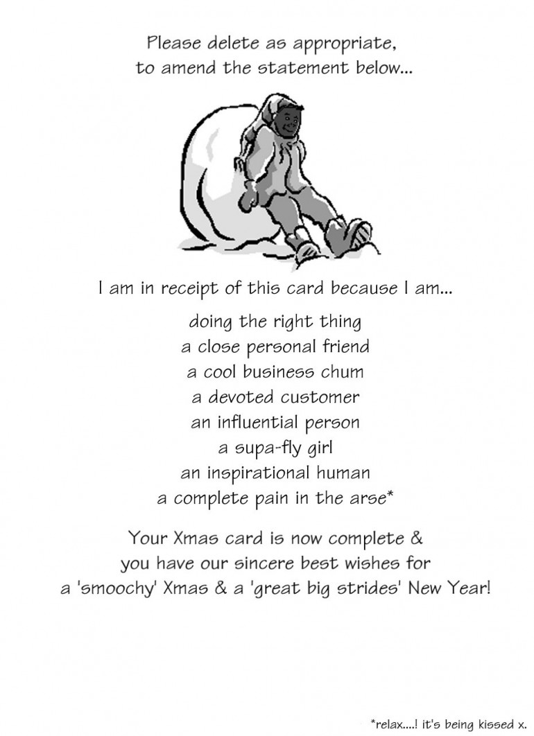 Looks a bit dated now really, but the 'relax, it's being kissed,' in the bottom right corner, is a sign that proper humour is just beginning to work it's way into things.
2001 'Ali' Front
Remember loving this one at the time, but feeling now that it hasn't really aged that well..? Looks a wee bit antiquated now, but at the time, was our finest work.
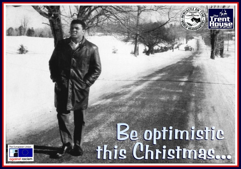 Hmmm... Hang in there, we get better at it in a few years.
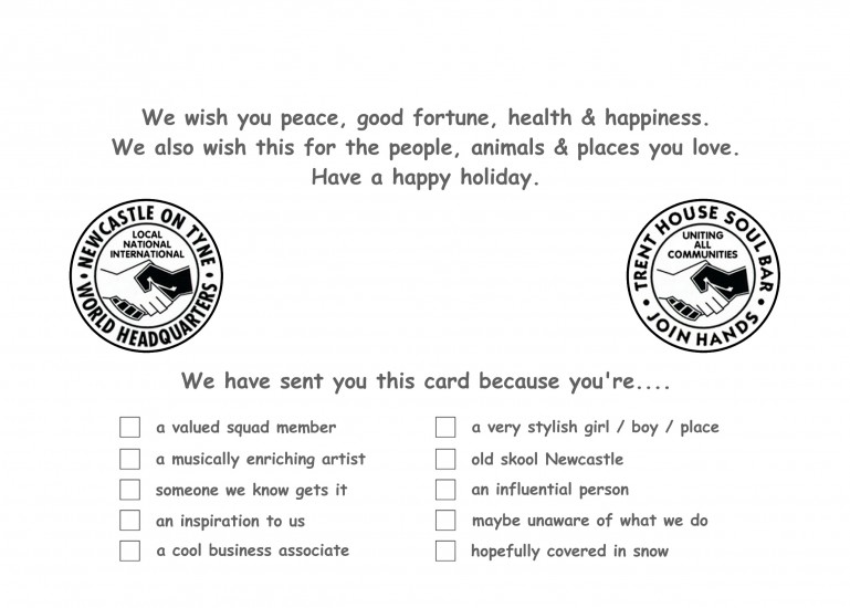
2001 Inside
Early execution of the 'tick box' caper.
 Now, which ones do you think we would we have ticked for you..?
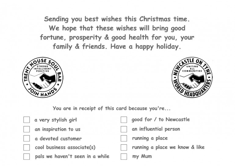
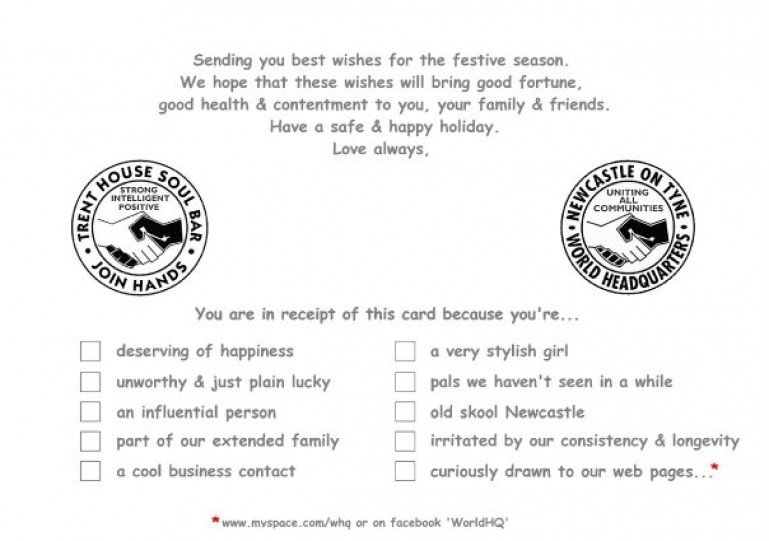
2001 Back
Club & Bar logos, straddled by our classic 'multiracial babies' logo. The back of our cards had up until now been bare, but as time marches forward you'll see us respond to the fact, that got on our tits.
 Still loving that tagline - it's pure Xmas vibes.
2002 Front
The 'Polar Bears' card pt 1.
This was the year the power of the card had dawned on us. It was 100% Festive cheer, but it was also becoming an awareness raiser.
When you see the inside & back in a mo, you can feel our game gently raising.
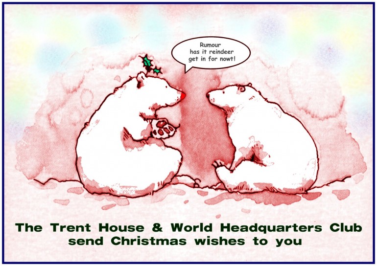 Sampled, re coloured & the speech bubble simply adapted - yup, hustling.
2002 Inside
 Can you imagine if you had a pub, this card was to you & we only ticked 'running a place..?' Disstastic!
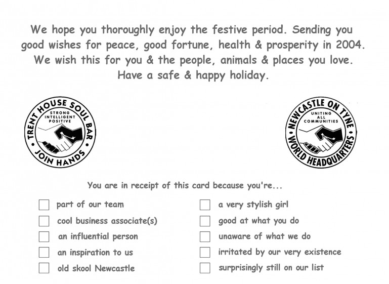
2002 Back
We used this back face to send our pals & business suppliers, a little sample of all the great, unsolicited press that WHQ & The Trent got that year.
Reputations are built over time & they don't just appear... You gotta hustle to spread your vibe.
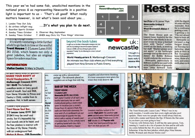 'Game' City..! Just look at that little lot..!! We're starting to really get the hang of this caper now.
2003 Front
The 'Polar Bears' card, year 2.
The Polar Bears are back, obviously being utilised to spread our message, but whilst also dropping a kinky little serving of festive 'sauce' into the mix.
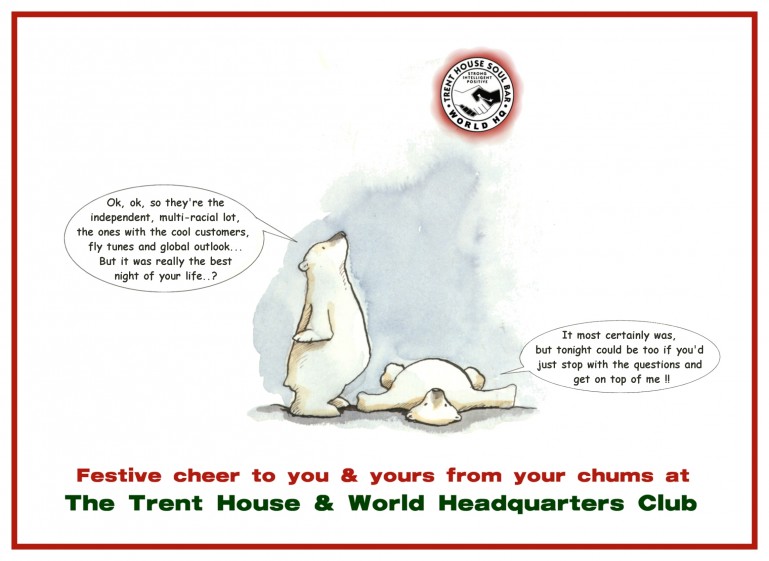 We feel a little 'sauce' at Xmas is totally appropriate - Just ask a cranberry.
2003 Inside
As you can see, a kind of style is starting to take root here, as slowly the cards get better & better...
You honestly could never even begin to guess, just how much work went into their design. They may seem, cheeky & effortless, but anything we ever made that presents like that, deffo has at least one all-nighter behind it.
This basic design structure layout for the inside really worked well, as we could sign it in between the two logos...
 This one's a proper belter.
2003 Back
Checking the text as you scroll on down here... It seems this was the year that Tommy had his David Attenborough 'moment' over in Amsterdam.
Check out 'Dam David' over in the 'Stuff we Like' section for all the gossip.
 Nice font, but surely having the back bare is wasted hustling space..? In coming years we go back to maxing out the back like we did back in 2002.
2004 Front
The 'Multicultural, Toddler Taskforce' card. This is one of our all time favourites & got our message across on every level.
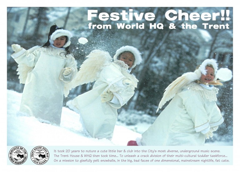 Just so feelgood & cute.
2004 Inside
Quite light & gentle in the tick box options this year, don't you think..?
Must have had a good one, without too many plods messing with us.
 That's deffo our established 'look' now, for the insides.
2004 Back
This was one year after we opened CM House & our chums Globe Gallery had moved in on the upper floors, so we played them in...
 Again, just a 'footer' with space going spare, but a really nice subtle use of colours on the text & overall, nice & tight.
2005 Front
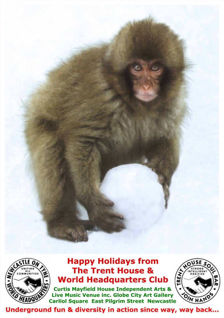
The 'Bear Family' card.
Dunno where the rest of it went, as we can't seem to locate the artworks for the inside or back..?
This was the first of a run of animals we did over several years, as raising awareness of the animal kingdom is a thing very dear to our hearts.
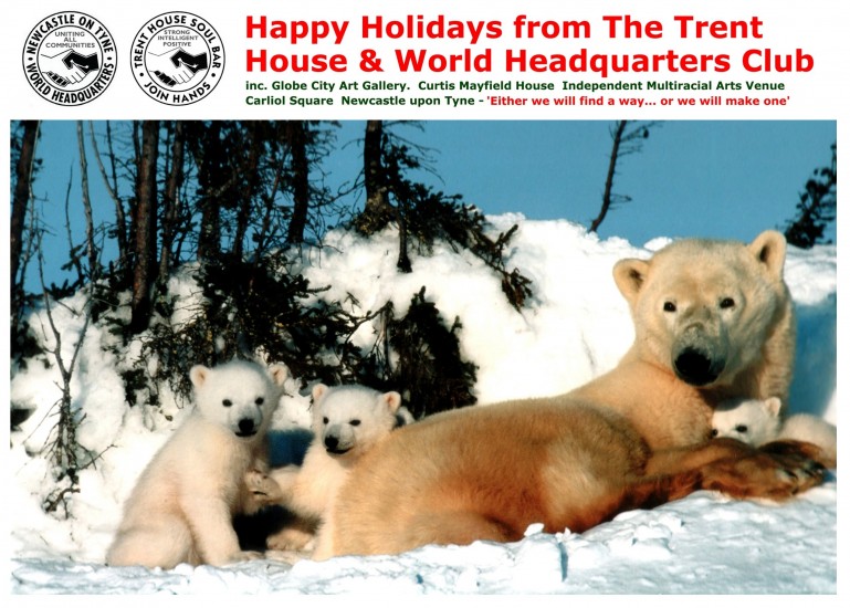 A lovely image of family - for Xmas.
2006 Front
The 'Lone Wolf' card.
Deffo the product of a long stint, devoid of any good ideas & way too many trips to the all night garage. This behaviour seems to have caused us to lose focus, bathe in our (self projected) hype, take ourselves way to seriously & temporarily disappear - up our own jacksies.
Not just into that tight, warm, dreamy, anal cavity mind...
Oh no, right up to the point where tonsils, can be clearly accessed & licked with ease..!
Check this...
The image was kinda meant to be a sort of 'metaphor' for the Club, symbolising us all alone & strong, straddling the cultural, musical wilderness of the Toon, all whist harbouring our innate & natural, sublime artistic power...
Eh.??!
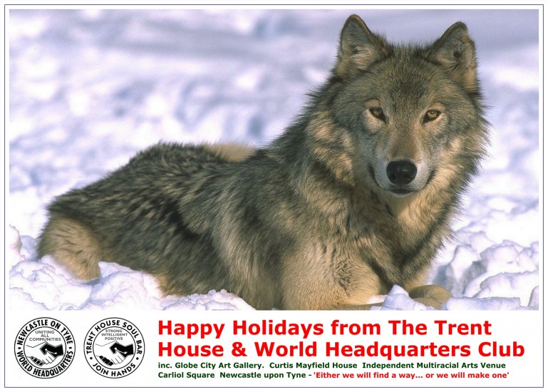 Years later, we now fully realise now, that probably only we got that - Ha!
2006 Inside
Yeah the 'Scared of wolves bit' below, kinda reinforces the colonic envelopment theory...
Nutters.
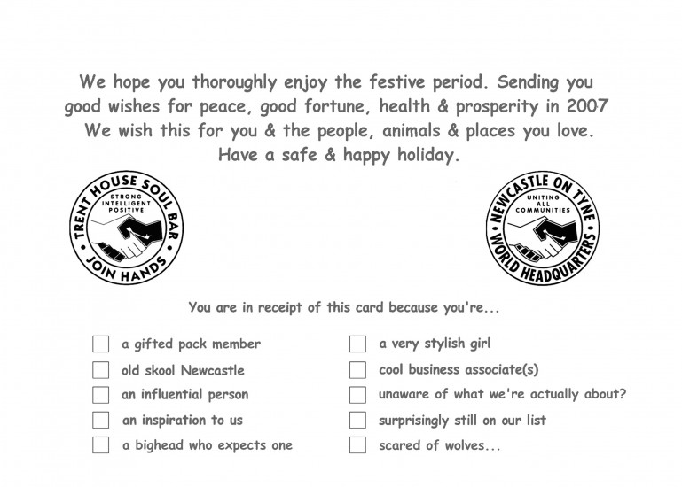 Still get points for bottom left though - a killer tick box.
2006 Back
Ah..! Seem to recall we'd done this side first..? Piled all our best ideas into it & then ran dry before tackling the cover...
That's probably what triggered the 'Wolfgate' rectal disappearance earlier.
Great copy on here, with quotes sampled from the Buddah, or some other deity-type bod. Rejigged to suit us & bingo - came over all wise.
The message really suited our Club vibe & was actually, once we'd given it a few tweaks, exactly where we were at & have stayed at ever since. The same copy popped up again loads of times on flyers we did & still today rings of WHQ 100%.
 'Myspace' - Bless..!
2007 Front
The 'Twin Sister' card.
The foolhardy, self indulgence of 'Wolfgate' long forgotten, we came steaming back to form in 2007 with this little puppy...
It was a big hit for us as we kept it simple. Animal - joke - out.
 Who can that be..?
2007 Inside
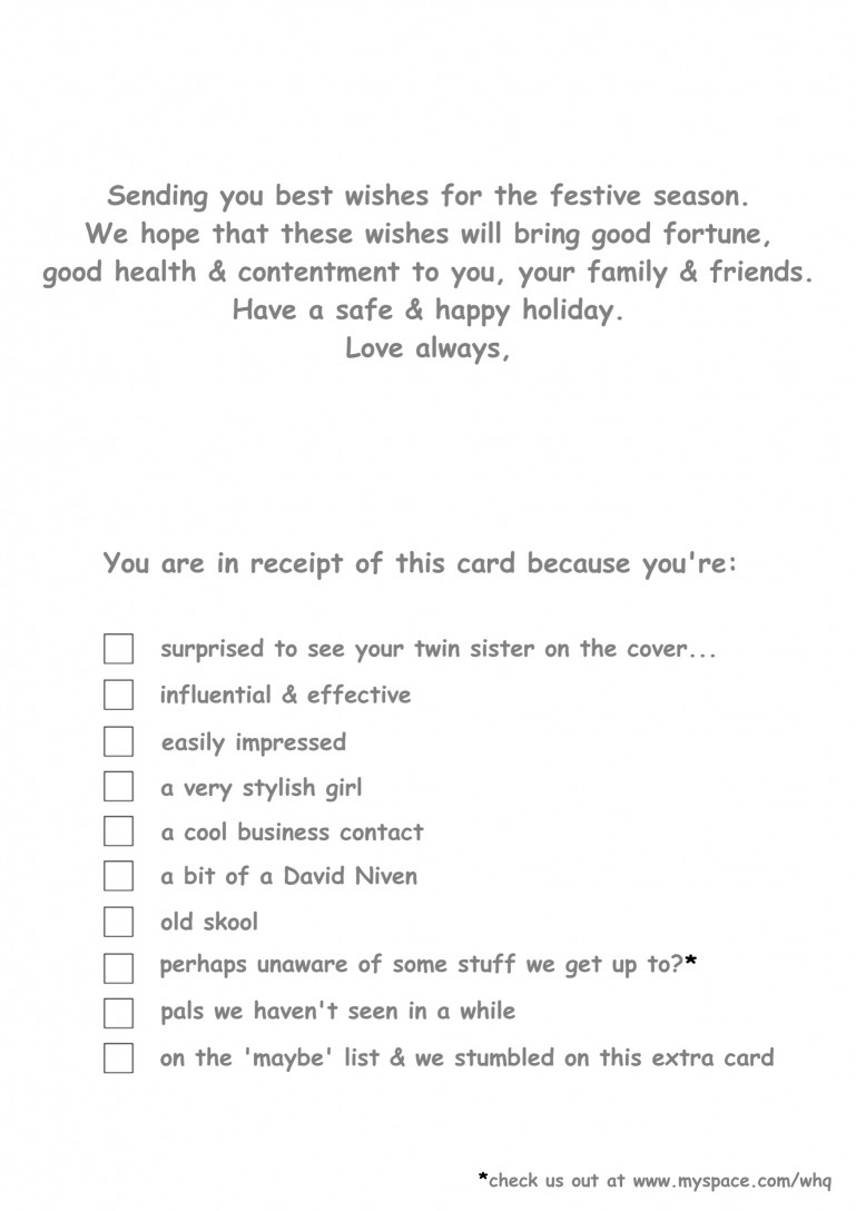 Gotcha..! - skills.
2007 Back
Having moved this year to portrait (to suit your twin sister) we rocked this 'Coexist' vibe, which at the time, was a relatively unknown image previously only really ever used by us.
Looks like a gap, but scroll on a touch & it's down there...
As you can see, we're still wasting a tonne of space on these back panels & we gotta start thinking about how to fix that.
 This was first time many people had seen that vibe.
2008 Front
The 'Teat Cow' card.
Picked this little lady up in Holland & was quite taken with her.
So we made her into the card for no better reason that that.
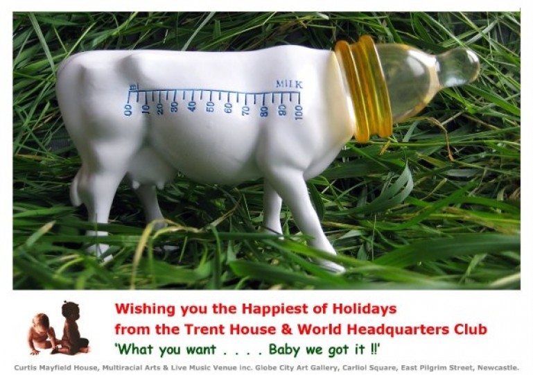 It's deffo got something to it, always has had. Still don't know quite what though..? A bit of an odd one.
2008 - Inside
Not quite funny enough in retrospect. Too much hustle & not enough wit.
You need both to hit the target properly.
 Not our finest work.
2008 Back
The inside might have been a touch flat but - Hello....!
Check this out, we've finally cracked it...
Filling up the space on the back & finding a way to add hustle, visual depth, longevity & history to every single card from now on.
We were so pleased with this face of the 2008 card.
Look closely & you can see the missing 2000 & 1998 cards on there too, which we can't seem to find now.
 Still rocking the same formula today, as you'll see when you scroll down.
2009 Front
The 'Bull of Many Colours' card.
After 25 wonderful years working there, we gave up the Trent in 2009 (long, long story, involving rodents, twitchy, armed plod & fully covered elsewhere on this site), so from here on in Xmas was all about the Club.
This year's card is another of our all time faves & the cow is again Dutch. The minute we saw it in a shop in the Dam it just said WHQ to us straight way. Colourful, strong & we knew it would make a dazza card subject.
Kinda like what we tried to do & say back there with 'Wolfgate,' but way more friendly & accurate.
More importantly, this time, - not lodged right up there, next to our small intestine.
It's a really visually arresting image, that sums WHQ up really nicely, as she sits right there on the turntable...
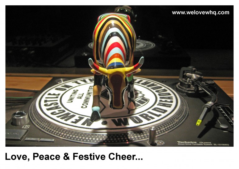 Totally smacks of strong, colourful, independence.
2009 Inside
Getting smart with the inside too, with loads of top notch & hilarious options, but only one that we needed to tick for (most) people.
Just one tick x 500 cards..? = (relatively) easy life & honestly, some of them are so funny..! Take a look...
 Ha! 'Due a recall to the circus..?' Total, flippin' gold dust.
2009 Back
Lookie here - See what we mean now, about almost having the back nailed..?
Every single inch of the card a hustle. All we've ever gotta do here on in, is just wiggle things about a bit, drop last year's card into the mix & our little Xmas card culture & Club is properly represented.
Top alignment would have helped, but we learn that pronto & were so made up to have basically cracked a cool plan for the back, that we missed that angle this year - Very almost nailed.
 MSP job - 'A design for life.'
2010 Front
The 'Mini Rudolph' card.
VAT was raised from 17.5 to 20% this year, clattering everyone. So we thought we'd reflect that in the card...
Might not seem that cute now, but was smack on the button with the times back then.
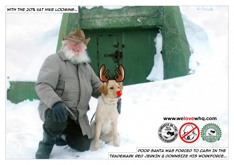 Looks like furlough is over for the lad.
2010 Inside
By now we had got comfortable with the 'barrage of insults & just one tick' formula for most folk. It just made life easier & gave us a better chance of getting the card out on time.
However, this of course meant we had way more time to mess about & we 'overwrote' the insults this year...
You have to know when to stop sometimes... Then take a nice deep breath to clear your lungs, pass on that last stagger to the all-night garage & calm your boots.
Still do quite like the 'opposable thumbs' bit though...
 Err... 'Hoisted by your own Petard..?' - Look it up. Could that be the sweet scent of imminent colon we detect..?
2010 Back
What can we say..? - It says it all. Makes up for going all 'Billy Shakes' on the previous face & last year's alignment lesson noted.
Tick, tick - gold star x.
 & relax....
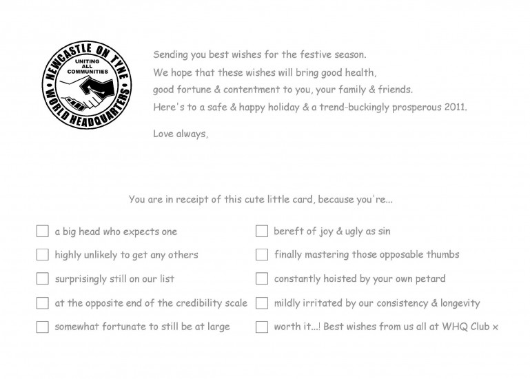
2011 Front
The 'Drunken Mother' card.
You always gotta love those little monkeys... The snow looks really good too, the gloss finish we use on our cards really lifted it.
 Off licence, stage right..?
2011 Inside
A rush job & nod to the 'surprised to see your twin sister on the cover' vibe from a few years back.
Think this one was deffo done in a hurry, as the Club was nuts.
 7/10, must try harder..!
2011 Back
As each year passed, the back just grew stronger...
 Lovely touch revisiting the 'Coexist' & chucking that in the mix - Depth.
2012 Front
The 'Sprouts' card.
Our finest hour to date for sure, Oh! how we loved this card...! Still do.
100% proof that sometimes you get lucky & that simple is often best.
Can you just imagine seeing this fella on someone's mantelpiece @ Xmas..? You know what you do..? You got straight over & you pick it up & read it, that's what you do.
Xmas nailed, in one single, glossy little image.
This is hustling so fly - It guarantees a smile when you open the envelope, before walking straight off the shelf into everyone else's hands...
Spreading our WHQ groove so fast - would put a global pandemic to shame...!
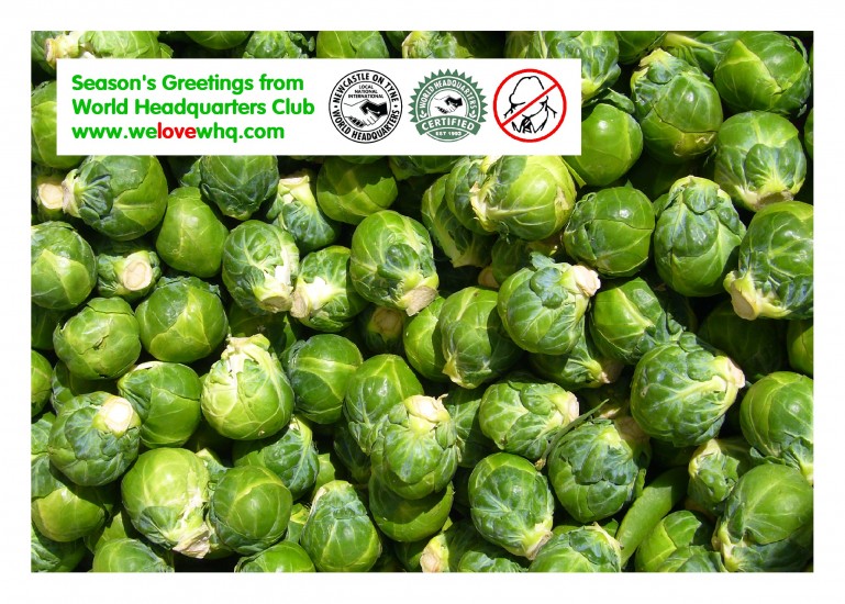 Dammm that's good...!!
2012 Inside
With the front so strong, we added a website hustle to the inside too.
This went to all the Djs who played the Club that year & it was so good, we printed more & sent them everywhere we could think of.
 A fine blend of praise, derision & wit. This card was loved by all.
2012 Back
 You knew for sure, that you were looking at a well established culture when you got this.
2013 Front
The 'Pigs in Blankets' card.
A slight evolution from the outstanding sprouts, we stuck with the 'instant Xmas' visual idea that had worked so well for us last year.
We bought the image online, as when we first spotted it, they had a download block on it, so we couldn't just sample it. Was well worth the money though & we were the 'Kings of Festive Cardland' once again.
The addition of our 'No Dickheads' logo for the last couple of years was a good one. Made folk who'd never seen it have to think twice - then the penny drops...
The bar was being set higher every year & yup - that piles the pressure on...
 It was almost like he could talk to people, telepathically from across the room & was saying 'Happy Xmas.'
2013 Inside
 Standard fare for us, though 'easily impressed,' was a nice 'faux' nod at self depreciation.
2013 Back
With the inside design standard & the back now standard, here on in, life in the run up to Xmas generally got (ever so) slightly easier.
 A really lovely layout this year. Nice even number.
2014 Front
The 'Snowman Hairdryer' card.
Couldn't easily top the last two, so this year changed tack & went with just a daft joke, that we knew nailed it.
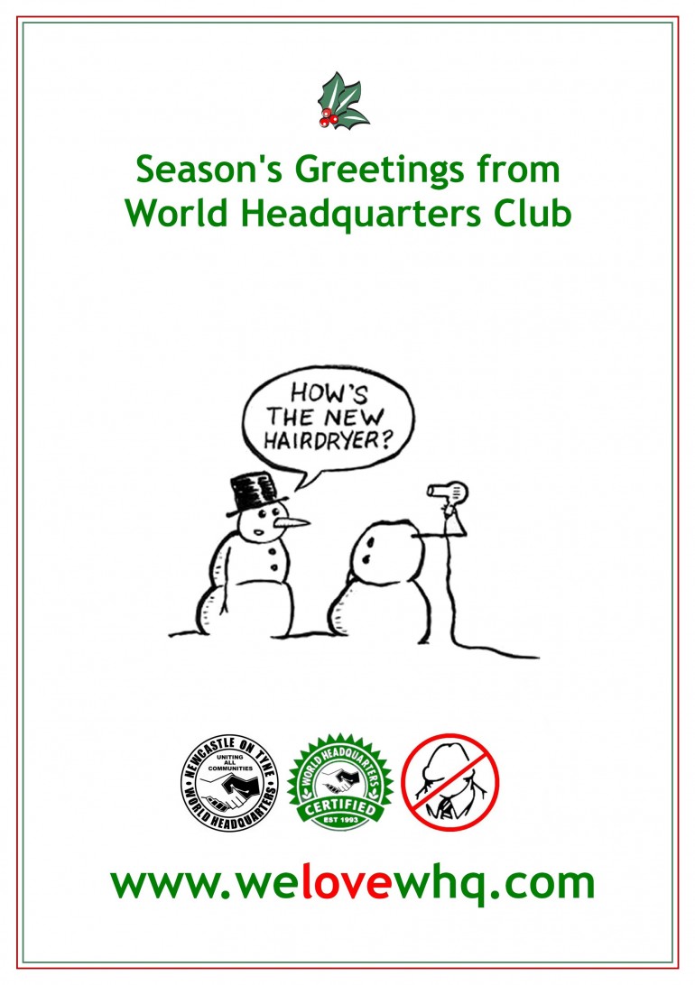 Infantile is sometimes best.
2014 Inside
Back to portrait this year, so kept the tickies nice & succinct.
 Works well as you read down & feel all good about yourself - if you didn't then get hit with the final one.
2014 Back
 So, so fly, as a portrait execution.
2015 Front
The 'Equality Bear' card.
It's a well known turn of phrase now (due to the advent of internet memes), but back then, that was hot off the press & a first time expose for almost everyone..
Tres WHQ - but how on earth we let that speech bubble font pass quality control, is beyond us now..?! Honking..!
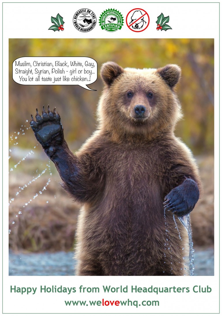 You can just tell we feel the world is about to go bananas...
2015 Inside
Social conscience creeping in here, as the pre-Trump era starts to take hold....
Really nice vibes & sentiment with the copy & tickies here.
 Sometimes you gotta poke people's heads.
2015 Back
 Solid, but then we already knew that didn't we readers..?
2016 Front
Trump rose, a boy washed up on a beach, Prince passed, you name it - all year more crazy shit just kept happening...
It felt like the World was in freefall & we reflected that chaotic, global vibe, in the card this year.
We rejigged & sat our logo on top of it as a message of hope to all our friends...
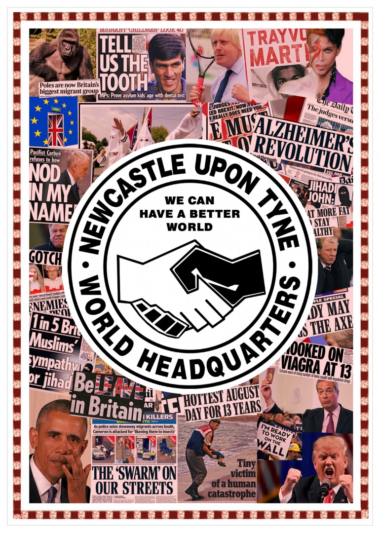 What a rubbish year that was..! - Great card though.
2016 Inside
Very similar tone inside to last year, as people still needed a nudge & the real work had already gone into the cover.
 As ever, WHQ takes a stand.
2016 Back
 We all know the deal with these backs now... When you get the perfect plan, you stick with it.
2017 Front
Was he meant to be Curtis, or was he meant to be Barry..? A bit of both really.
With the Brexit waffle in the UK & Donny the plum in America etc., the world was hurtling towards being such a mess, that we decided to inject a bit of light-hearted happiness into proceedings cover wise.
 Yup, it's a nice friendly opener for sure.
2017 Inside Front
This was the first time we'd printed the inside front cover, as well as the usual, inside facing cover too.
We had to plug the Club, but the crazy political situation also needed addressing. So we maxed every single possible bit of space across the two inside faces...
 This was inside front, there's more (inside facing) action below.
2017 Inside Facing
So this was inside facing...
This was the year we launched WHQ & Nat Turner Live Events, so a little mention was standard. We wanted folk to actually question themselves & their values too, so we 'quizzed' it.
This year, the tickies were for them to fill in & went for the jugular, both morally, socially & politically...
 The questions also obviously clearly spelt out where we were at as a Club.
2018 Front & Back
This is both outer faces presented together. The front is dope - take a look...
Rainforest destruction, animal extinction, refugees, the boy Donald, Brexit, arms deals, it's all in there - with a side dish of Bethlehem.
Took us a tonne of work, but everything really great often does.
 Yup - not that cheery, but really smart, sharp & topical.
2018 Inside
Front cover took so long to properly execute, that we ran out of time & inserted just one simple tick-box, that got us off the hook...
 Sometimes for it to work - you gotta cut your art lean.
2019 Front
The 'Xmas Means Capitalism' card.
Mary & Joseph taking selfies, the three wise amazon delivery men, you get the drift..?
Take a look - it had levels & was a nice pastiche of the times we live in & modern society as whole.
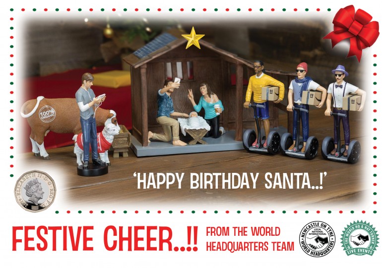 The 'Happy Birthday Santa' angle totally nailing it.
2019 Inside
This was obviously a landscape card, so again we hustled both inner faces.
Here it is folded out, so you can see both as they presented...
 'Cops, but we feel obliged..?' - Love it..!
So there you have it
That’s what we do each year, while you are all snug & tucked up in bed in early December. We’ve really enjoyed popping all the cards up on the site, as a whole body of work & reminiscing with you.
 There's you, all snug & tucked - While we are still wide awake & considering the relative humour - of assorted, utter nonsense.
They can be such a mission to get out on time, that usually after we've posted the last one, we just put the whole caper out of our minds until the next year. Then we briskly skip, straight on to our next hustle, in the race towards New Years Eve.
We had so much stupid fun over the years making them with our crew & rest assured, even the odd ones that maybe seem a little dated now, were still the total bomb at the time we sent them out...
'Errr... Don't I mean to be pedantic, but to my mind, that's not strictly a....'
It’s yet another aspect to WHQ & our journey through life in this city, as we spread quality, positive vibes, which you may not have been aware of. We hope you enjoyed sharing in our little obsessive festive tradition.
Uncle Covid put the block on 2020's card, as we couldn't justify all the postage in a year when we had make staff redundant. Then in 2021 were so busy stabilising things there just wasn't the time.
We plan to come thundering right back on it for 2022... x
Related Articles